
Travel Agency
Best Colour Choice, Young Designer Award 2014, Nippon Paint (H.K.) Co., Ltd.
2014
Group project
Pao Siu Loong Care & Attention Home
Our aim of setting up this travel agency is to provide primary services. Both travel agency and participants can co-operate together in this programme. We are designing for elderly who need extra care and consideration for the planning of tour. In our programme, we provide 3 main services : pre-tour services: planning & training; aftertour services: promotion.
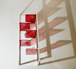
We use three primary colors which are red, blue and yellow to represent the aim of setting up travel agency and our primary services. The co-operation between staffs and elderly is like mixing the three primary colours. Thus, it can develop different possibility. We also apply the color mixing to the interior design by mixing the color of glass to glass and glass to wall. Therefore, the aim of setting up travel agency, programme and interior design are linked together.
 |  |  |
|---|---|---|
 |  |  |
 |  |  |